SOSHELL
Designing a Personalized Platform to Find Events and Meet New People
Timeline: 4 weeks, June 2023
Role: Sole product designer with mentorship from a Senior UX Designer
Tools: Figma, Google Workspace, pen and paper
Constraints: Project prompt, limited research, time limitation, sole designer
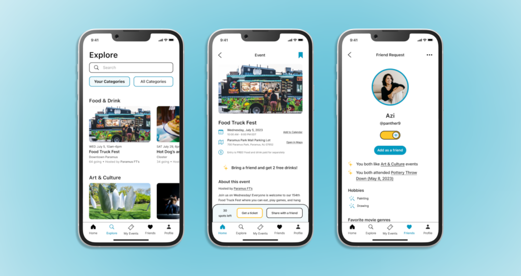

A new startup has developed a social product that helps users get out, meet new people, and find fun experiences to explore and enjoy. A problem that the startup identified in this product is that the amount of people who end up going to events is a much smaller percentage than the amount of people who register for them.
- Business Goal: increase the conversion of accepted invites to event attendees
- Design Opportunity: develop a social experience platform that helps users feel confident in committing to events and meeting new people.
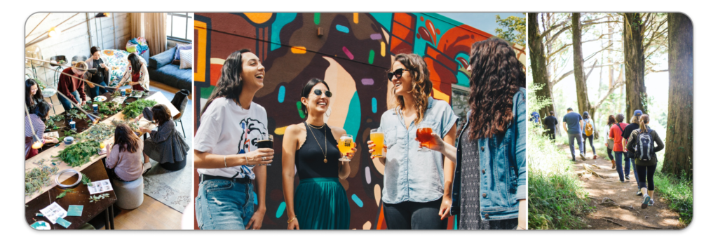
My first step in tackling this design opportunity was to establish criteria that would be necessary to address when designing a solution for this product. From reading the project details set by the startup’s Product Manager, I was able to outline criteria for the project. The product would need to:
- Offer effective communication about upcoming events
- Incentivize users to attend events in a cost effective way for the company
- Help users who have moved to a new city to find events and meet others in the area
To get a better idea of what exists in the sphere of event related applications, I conducted a competitive analysis to understand what currently works well and what elements need to be avoided to best serve users. For this analysis I looked at Facebook Events, MeetUp, and Eventbrite.
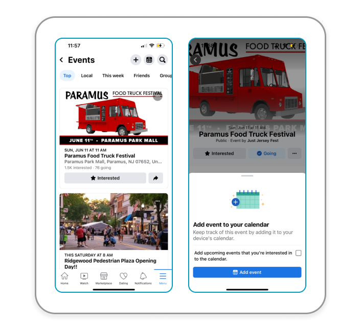
Facebook Events
Summary: Facebook Events has a very friendly interface. For Facebook users this is a welcoming way to show what is going on in your area and what types of events could interest you. What I especially like about this interface is the way that you can easily share events with friends and are shown ways to invite friends to the events. This can be instrumental for the startup in that the likelihood of users coming to events could increase if they are going with their friends.
MeetUp
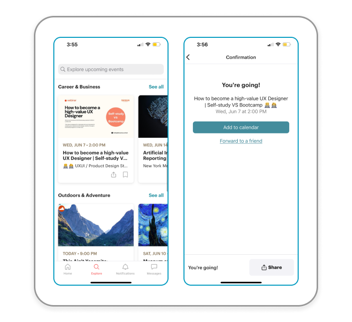
Summary: MeetUp is a great app to use to see upcoming events in many locations. What works about this app is that it showcases a wide variety of events that are based on your interests. The app has a wide variety of event categories which is great for people who are interested in whatever is going on in their city or neighborhood. Having a direct messages feature is also a good way to make sure your friends are going to the events you’ve RSVP’d for as well as connecting with new friends you’ve made at events.
Eventbrite
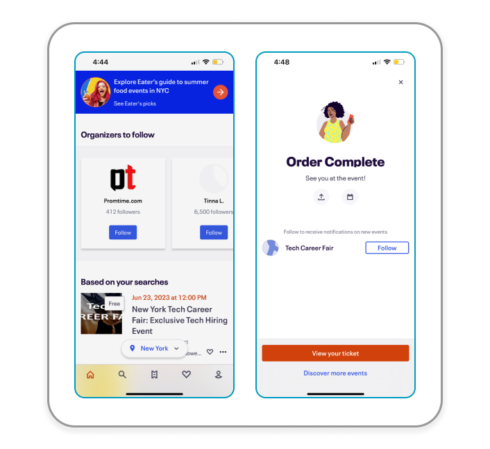
Summary: Unfortunately, Eventbrite was the most frustrating app to use out of the three examples. It has the lengthiest RSVP process out of the three apps, but I’m curious to know if this makes the attendance rate of the events higher. Regardless, the design of the app itself doesn’t use very friendly colors and the UI at times is visually overwhelming. This app showcases more paid events as opposed to free events, which becomes unattainable for some users. The only element that I believe is worth emulating is the way tickets are shown as if it’s a physical ticket, a design choice which I find is fun and creative.
From conducting this analysis I was able to find elements in Facebook Events, MeetUp, and Eventbrite that could elevate the startup’s product. By taking the information provided for me in the project brief, studying competitors, and analyzing the problem at hand, I was able to structure the design opportunity as a How Might We statement:
How might we design a social experience platform that is inclusive to all, informative about events, and offers a way to connect with others to make new friends?
Equipped with the information about the current state of the project as well as the necessary criteria, I began to learn more about who I would be designing this product for.

While a majority of the project research was organized and conducted by me, the startup offered some information into who the target user of the product would be. The target users are:
- Between 32-55 years old
- An equal split between men and women
- Middle class
- Recently relocated to a new city
By having the target user established, I could use the information as a jumping off point into figuring out the “why” in this problem by conducting secondary research and sending out a screener survey. With these methods, I sought answers to a few key questions:
- What are users’ pain points when it comes to finding and attending events?
- What are the most common reasons for why people don’t end up going to events?
- Are there incentives that could encourage users to attend events?
In addition to these questions, I wanted to gather more insight into difficulties adults have with finding and attending events. The users I sought out to interview after collecting the screener responses were split between men and women and with levels of introversion and extroversion. This was to get a range of answers within the small demographic to have a more comprehensive view of who I would be designing for.
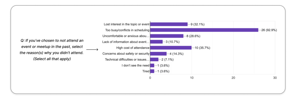
Of the 28 screener survey respondents, about 92.3% of users stated that being too busy and having scheduling conflicts were major reasons for why they chose to not attend an event. Losing interest, discomfort and anxiety, and high costs to attend are other dissuading reasons.
With the information I gathered in the screener survey, I did online research to find potential pain points for users when it comes to event attendance. Uncovering these pain points helped me to further establish criteria that needed to be present in the final product. Examples of the pain points include:
- The fear of not being accepted or acknowledged by others at the event
- Not having a way to break the ice with others
- Their social battery running low when in large groups and events
Understanding these potential pain points and having further discussions with users about them will help to develop a product aimed at helping users feel more comfortable with going to events. The solution will need to help users feel confident in committing to events, foster effective communication, and encourage participation in a fun and welcoming way.
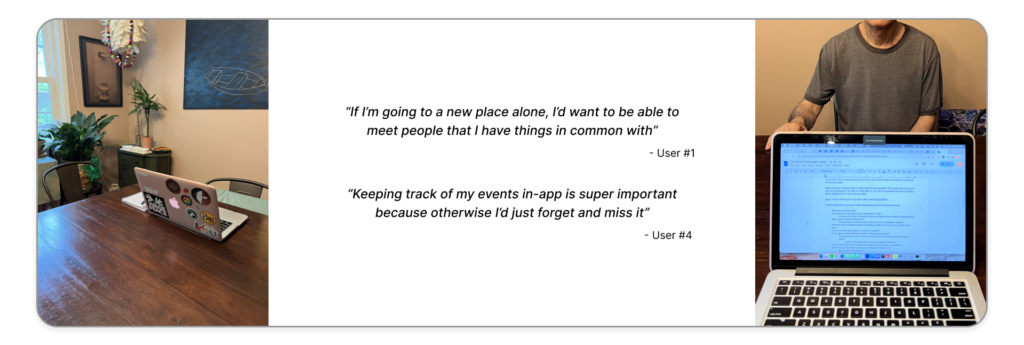
The next step I took in the research process was conducting user interviews with five users who fit the target user demographic. These interviews gave me the opportunity to talk one-on-one with users who have had experience, both negative and positive, with attending events and what comes with the process of it all.
From listening to the interview recordings of the five participants and analyzing my notes, I was able to make two general user groups that exist within the target user demographic. These groups are:
- The event seeker; someone who finds events and attends them solo or in groups.
- The event avoider; someone who is more cautious about finding and attending events, especially not alone.
For those that find themselves erring on “avoiding” rather than “seeking” or vice versa, there were factors that became necessary for both groups when it came to attending events. To synthesize this information I developed an affinity map to see what could be gleaned from the culmination of my interview notes.
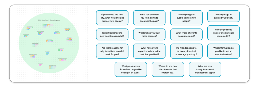
Analyzing my notes and grouping together the answers from the 5 interviewees helped me to see the different types of responses from both the event seekers and event avoiders in the affinity map. The gathered insights from the map include:
- 160 total sticky notes collected from the 5 participant interviews
- 15 clusters of sticky notes signified by a question (as seen above)
By having this map to refer back to, I was able to move forward with beginning to design a solution to the design opportunity without biases and preconceived notions about what users want in a social experience type of product. My next step in the research process was to lay out an end to end experience map that a user could take in their process of finding an event that they are interested in.
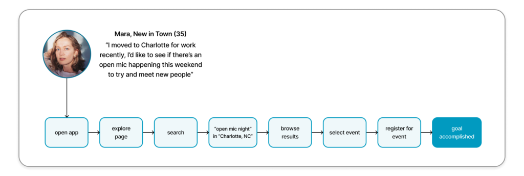
Laying out an end to end experience map helped me to generate possible solutions for the “How Might We” statement that was outlined earlier in the project. The solutions needed to be in line with the statement and offer a seamless and informative experience for users to find events that interest them as well as offering a way to connect with others as a true social experience app. The above map illustrates the direction that I thought best achieved the users goal and had the biggest opportunity to have features added onto it.
With the synthesis of notes from the screener survey, user interviews, and affinity map as well as the possible route a user would take with the end to end map, I developed an MVP of User Stories as the final research method I would use.
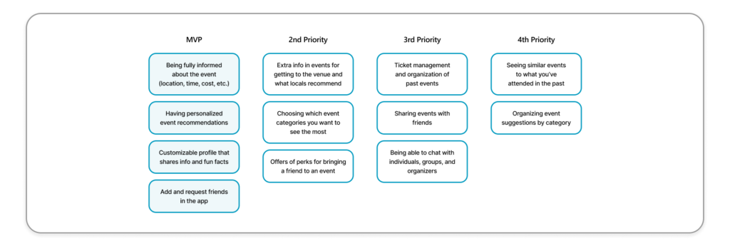
Being able to prioritize user needs with the MVP gave me a clearer picture of what elements were absolutely needed in the final product and which elements would elevate the user’s experience with it. The elements that would have to be at the highest priority in the final product are:
- Being fully informed about the event (location, time, cost, etc.)
- Having personalized event recommendations
- Customizable profile that shares info and fun facts
- Being able to add and send friend requests in the app
This would be an important map to look back on while developing the final product to make sure that the users’ needs were being met with every feature I designed.
Having wrapped up my research and feeling equipped to move on to the next step of the process, I began designing elements that would later shape the wireframes of the final product, starting with developing a brand identity.

For this part of developing a solution to the design problem, I needed to think about both the branding of the product and the path a user would take when using the product itself. I started with the branding and visual identity of the product which included ideating and landing on a name for it.
The project details that were outlined by the startup included information about the company’s brand.
- Brand personality: a trusted friend that cares about helping people and making a difference in the world
- Brand attributes:
- Caring
- Familiar
- Humorous
- Optimistic
Having the brand personality and attributes given by the startup made it exciting and fun to ideate the UI elements of the product as well as the name and characters that would be a part of it. The final design needed to encompass the company’s attributes and to feel like a trusted friend that cares about not only making a difference in the world, but cares about the users themselves.
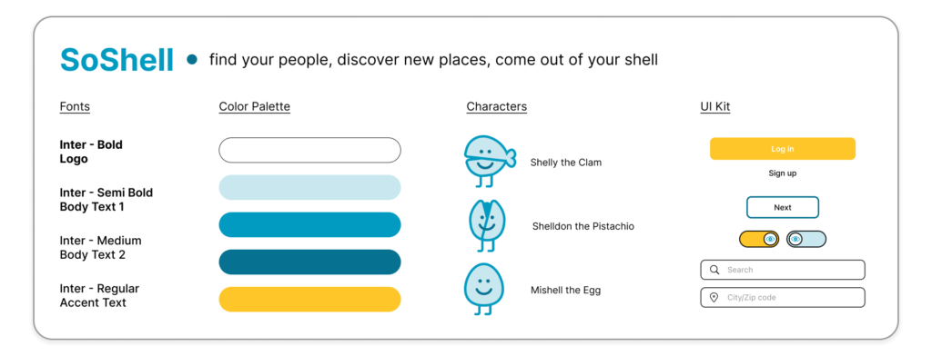
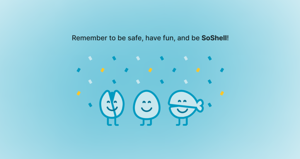
I chose the name “SoShell” as a fun play on the word “social” and the shelled mascots, a clam, pistachio, and egg that are seen in the app itself. The final design is in line with the startup’s energy and brand, but also has elements that are welcoming to users in that it’s easy to understand, has a legible font choice, and uses calming colors.
Establishing a solid brand for this project was important to me because the product is meant to be inviting and encouraging for users who would typically be dissuaded from attending an event. To have SoShell be a fun and identifiable application that invites users to a world of events and social possibilities is the ultimate goal, and to have the branding encompass and uplift it would only elevate the final product.
Once the branding and style was established, my next step was to lay out the user flows that would be the most important paths taken within the app.
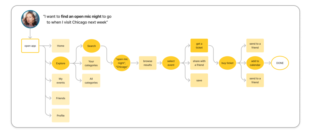
To start visualizing how the app would function, I laid out the user flows for SoShell that illustrates the red routes a user would take when going from A to B in their processes. Doing this helped me to generate and iterate on how a user would go through the key flows in the application laid out by the MVP’s. Above is one of the user flows that someone using SoShell would go through to find an event in a city to go to.
Once the user flows were made, I began visualizing and laying out the screens to be made in the low-fidelity wireframes that would help bring the user flows from a chart to usable screens.
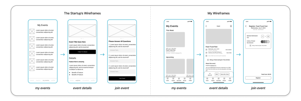
The startup had three wireframes pre-made that I was able to reference when designing the wireframes. Their frames illustrated the general content that needed to be in the final product and gave free reign to adjust the designs to fit the branding I had developed. I developed my own wireframes using Figma and referred to my research notes as well as my MVP and user flows to make sure key screens were present.
Once I had completed the wireframes, I added transitions to make them a usable prototype to get into the hands of users. I reached out to potential participants that fit in the target user demographic and conducted my first round of usability tests with four participants.
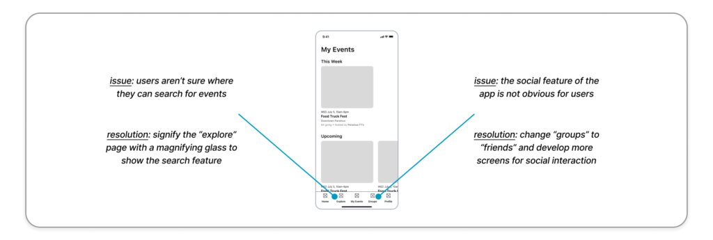
For the test I had created three different tasks that the participants would go through with the SoShell wireframes. What I looked to uncover from testing was to see if there were hiccups with users navigation, where they had difficulty understanding the content, and if they had any issues with the application in general. Another important factor to consider was whether or not users felt that SoShell offered ways to find events effectively as well as being a social app. With this criteria in mind, I conducted all tests with an iPhone 13 that had the prototype ready to test with via the Figma mobile application.
This first round of testing yielded positive results in terms of navigability and being very informative of event details and searching for them. With the positive feedback came an issue that was vital to address; at this point in the project, the app was more for finding events than it was for finding friends. I knew for my next steps that I needed to determine how I would better amplify the social aspect of the app to better execute the design opportunity of finding new events and meeting new people.
Keeping in mind the changes I needed to make, my next step was to refine my wireframes to create high fidelity screens.
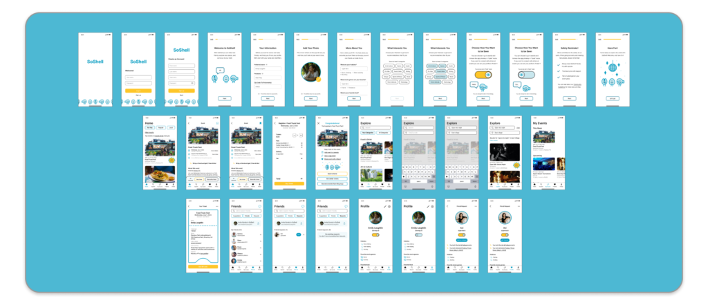
Click here to use the prototype
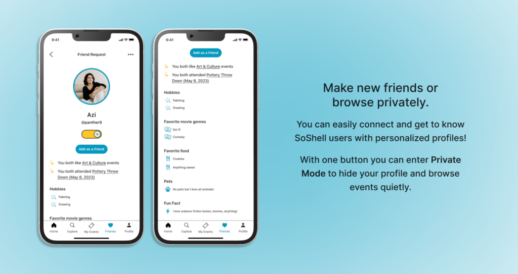
Creating the high fidelity screens was a fun way to mesh the wireframes of the key flows with the UI elements and imagery that would give SoShell its character. While I was creating the screens, I referred back to my usability testing notes and thought further about what could be made to elevate the brand and its interactivity. I added an onboarding process as well as a more fleshed out way to meet new people and see what their interests are.
My goal with these screens was to have a realistic prototype that would be immersive for users and have SoShell feel like it could be launched that day. With the final screens prototyped, I developed another set of tasks for the second round of usability testing to see if the previous issues were alleviated and the final product would be well received.
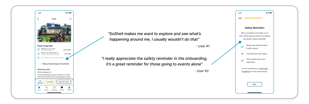
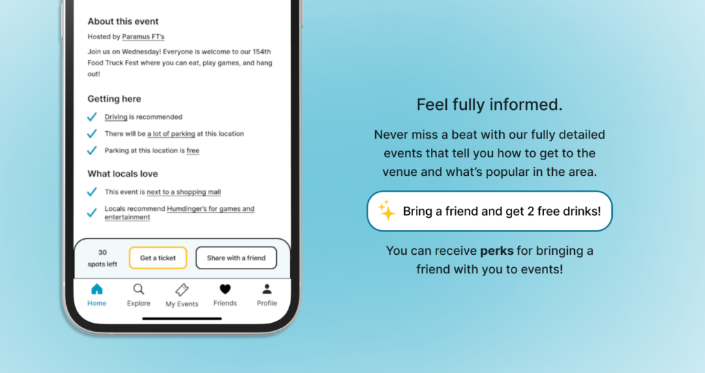
The second round of testing proved to be very successful in terms of the likability of the branding, the ease in which users navigated the app, and the acknowledgement of both the event finding and social aspect of SoShell. Users expressed interest in the locations and felt comforted knowing that there was a lot of information about the event, how to get there, and what there is to do in the area. They also felt eased into the app with the onboarding process which made them feel welcomed into the possibilities of SoShell.
From synthesizing the interview notes I found some interesting feedback to glean from.
- 4/4 users would recommend SoShell to a friend
- 3/4 users would go to events if they were as detailed as they were on SoShell
- 4/4 users would use SoShell to meet people at events
Seeing the response from users proved that SoShell effectively tackled issues raised by the startup and would encourage both event seekers as well as event avoiders to attend events and meet new people.

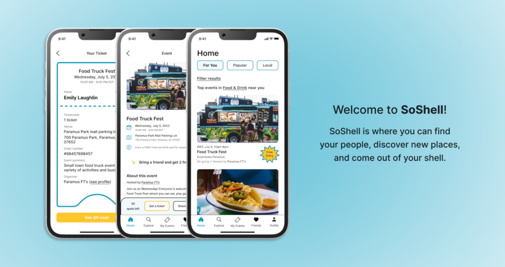
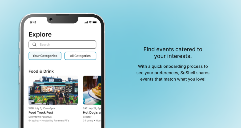
Introducing… SoShell!

What I Learned
Add joy when developing a brand identity. In making this capstone project, there wasn’t a time slot in the design process for the brainstorming via sketching that I have done with other projects. Where I was able to be more creative and add my own tastes was in designing the brand identity for SoShell with the little shelled characters. This was a lot of fun for me and helped tie in the story of SoShell as a fun and welcoming app for people, some of which might otherwise be dissuaded from an event related app. Making the app feel more fun and inviting opens doors to those who are more guarded and can make people more willing to experience different events.
Accept mistakes and move on. When I had completed my wireframes and began user testing, it dawned on me that I didn’t create enough screens to satisfy the full experience of the social part of the app. Instead of letting myself get down on my mistake, I jumped into designing and developing more screens in the high fidelity frames to be tested again. Having made this mistake showed me that I can be more organized in laying out the next project and to remember to always refer back to the project notes.
Projects will always evolve as time goes on. While I was the sole designer for this project, a typical project would have multiple hands and voices contributing to its development. There were moments where I felt like I had a lot on my plate and that every aspect needed to be fine tuned to perfection. In these times I had to remind myself that I was doing it with the intention of improving my design process, becoming a more refined designer, and working to elevate the experiences of others. Projects like this will always change as more tests are conducted, which will make projects like SoShell better and better.
Next Steps
Adjust features for it to be the best social event app. For SoShell to be both for finding events and meeting new people, the social aspect of it should be expanded upon further. With more user testing and feedback, I will be able to see what features work well for users to meet other users and what features need more adjustments. Hopefully with more user feedback and stakeholder input, SoShell can be a powerful competitor to the other social and event related apps on the market today.
Expand on the social features. A lot of users will use SoShell in tandem with other forms of communication such as Instagram, Facebook, sending texts, and so on. A feature that will make SoShell the go-to communication app for it to be able to quickly and easily share events with friends. A potential new feature to test is a social feed within the app that helps users see what events are popular, where their friends are going, and what events have been shared with them.
