POSTUP – DESIGN SPRINT
Designing a Search Feature that Puts User Needs First
Timeline: 1 week, May 2023
Role: Sole product designer with mentorship from a Senior UX Designer
Tools: Pen and paper, Figma
Constraints: Project prompt, time limitation, sole designer
Day 1: Understand and Map

PostUp is a new startup where freelancers and remote workers can share tips, get advice, and network with each other. Now users want to find public places where they can do quiet work, have phone calls, and have in person meetings with clients and coworkers.
Design Opportunity: make it easier for remote workers to find great public places to work from
This design opportunity was presented as a design sprint that I would face head on. The project had criteria set by PostUp that needed to be in the final product. It needed to:
- Be a mobile application
- Find places that already exist
- Charge a monthly fee in exchange for user access
Equipped with the design opportunity and constraints, I began to learn more about who I would be designing this product for.
Research and Personas
The PostUp team asked users to talk them through how they go about finding public places to do remote work from. What I was provided were quotes and highlights from current users about what they found were important aspects of finding places that fit their needs when working remotely.
“Wifi and bathrooms are the most important thing I look for, especially if I plan on working there for a full day” – Jane
“I like to know how crowded a place is… If I’m meeting clients or coworkers there, I want to be sure we can get a place to sit and talk for a bit” – James
Other research highlights from users included having adequate seating, knowing if spaces are quiet for calls, and “bonus points” for places offering an adequate idea of what it’s like before venturing out. Overall, users want to know as much as they can about a place from a quick glance on an app.
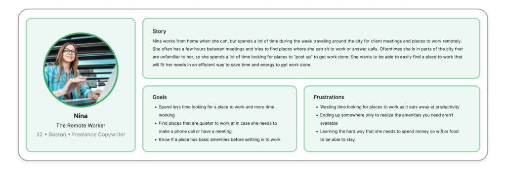
With the information provided, I generated a persona who would benefit from the opportunity PostUp has assigned me to create. This persona coupled with real-life testimonials from users aided in creating a How Might We statement:
How Might We create a seamless and informative search experience for users to find public locations to work from?
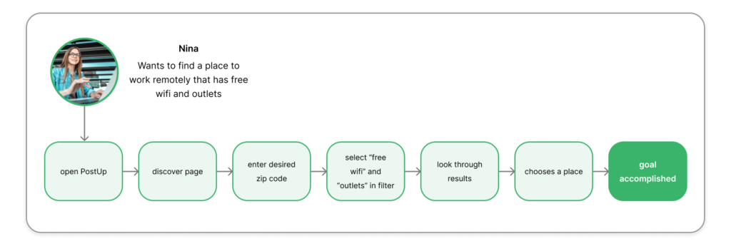
My next step was to create an end-to-end experience map to quickly generate potential solutions for this How Might We statement. These solutions needed to be in line with the statement to offer a seamless experience for users to find a place to work using the PostUp app. The above map shows the direction that I thought best achieved the users goal and had the biggest opportunity for an app feature; a way for users to filter what amenities they want in a public work location.
Finally, I reached out to potential users to be interviewed on Day 5 of the sprint. The chosen users would be participating in testing the prototype I create on Day 4, and act as prospective users of the PostUp app.
Day 2: Sketching the Solution
Lightning Demos
To start off Day 2 I conducted a condensed version of lightning demos to compare features of existing applications that are similar to what can be used to elevate PostUp. From a 30 minute research session I found three applications that I downloaded and examined further for interesting features, strong UI, and seamless navigation for users.
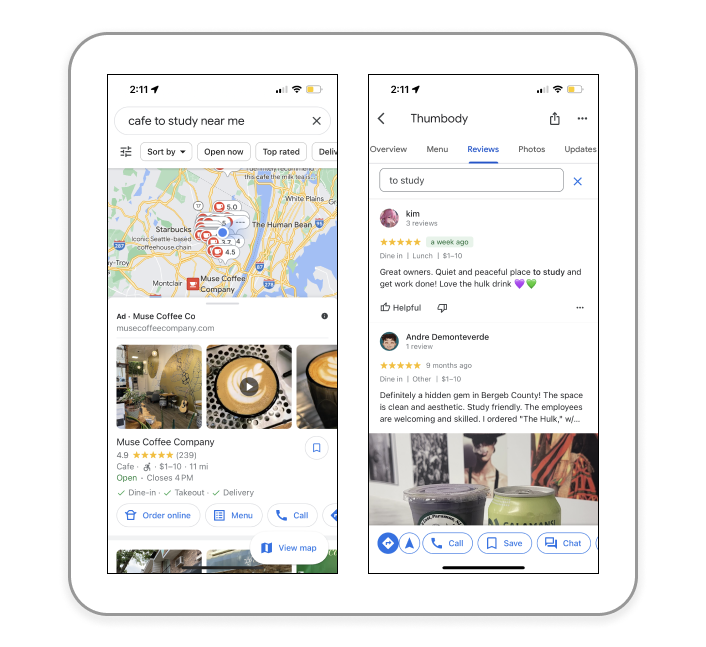
Google Maps
What works: typing in what you want and getting user reviews that reflect your search. While this isn’t immediately apparent when using the app, you can type in specific terms such as “places to work” or “cafe to study near me” in the search bar and you will get many results and reviews with keywords from your search. This feature is great in a pinch and makes the process very easy and friendly for users to look for places to work. Another great feature is user submitted photos for others to get an idea of what a place looks like on the inside and how busy it is before going.

Maïka
What works: a rating system for the amenities submitted by users. While this app focuses only on cafes, the element that I thought was effective was that users could rate places on the availability and reliability of certain amenities it has. While Google Maps has a much higher amount of reviews and ratings, Maïka can save users time in that they don’t have to go to the cafe to see if they have the amenities they need.
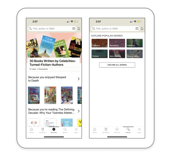
Goodreads
What works: the customized discover tab and search tab. I like that this app gives users a way to discover books that are similar to ones they’ve enjoyed in the past. This feature could come in handy for users who like to work remotely and want to find cool new places that are similar to places they’ve rated before.
From conducting these demos I was able to find elements in Google Maps, Maïka, and Goodreads that could elevate PostUp in the way they assist users in finding places to sit and work.
Sketching Solutions with the Crazy 8’s Method
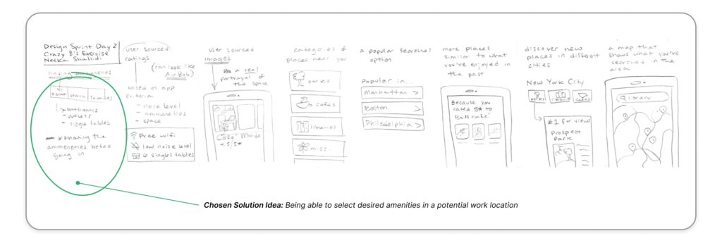
By utilizing the crazy 8’s method I was able to quickly generate eight potential solution ideas based on the criteria PostUp set out, as well as the additional ideas I made with the end-to-end map from Day 1. This method of ideation was very fun and helped to make the ideation process fast and efficient.
The screen I thought was most important out of the eight was a combination of a few, most notably the first one outlining the amenities available in potential working locations. From the user comments provided by PostUp, many expressed that certain amenities, including free wifi and available outlets, were extremely important criteria when finding a potential location to work in. Being able to filter desired amenities will best address the problem I have been sent to solve by the PostUp team.
After deciding which screen was the most viable solution, my next step was to draw out the solution sketches and iterate the interface of the application.
The Solution Sketch
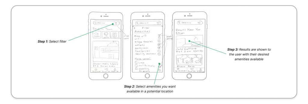
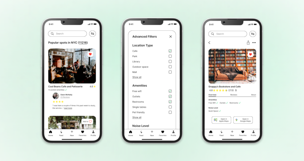
In deciding that filtering the amenities of locations is the most important element in the PostUp app, I started sketching out the screens. The screens illustrate three of the key steps that users could see in the process of choosing their desired amenities when looking for a location to work in.
- Screen 1: Selecting the filter button to narrow down their choices
- Screen 2: The user selects their desired filter options
- Screen 3: Locations that have their selected amenities are shown to the user
With the solution planned out on paper, I was now ready to break down the process that would get users from point A to B.
Day 3: Create a Storyboard
Midpoint Reflection
When deciding what solution would best serve the PostUp users, I looked back at my research from Day 1 of the sprint. I wanted to see what users were most concerned about and what they wanted in the experience that was currently missing. What I was reminded of were the anecdotes of users noting that they want to know the amenities a potential work spot has before making the trip. Having an advanced filtering system of locations in the area users want to work in will make selecting a place to work more streamlined. An added benefit that this solution has is giving users with anxiety in social situations the ability to check the environment beforehand via reviews, photos, and notes from other PostUp users.
With this in mind I set out to illustrate a storyboard that a PostUp user would see on the app to select a location to work in remotely.
Storyboard
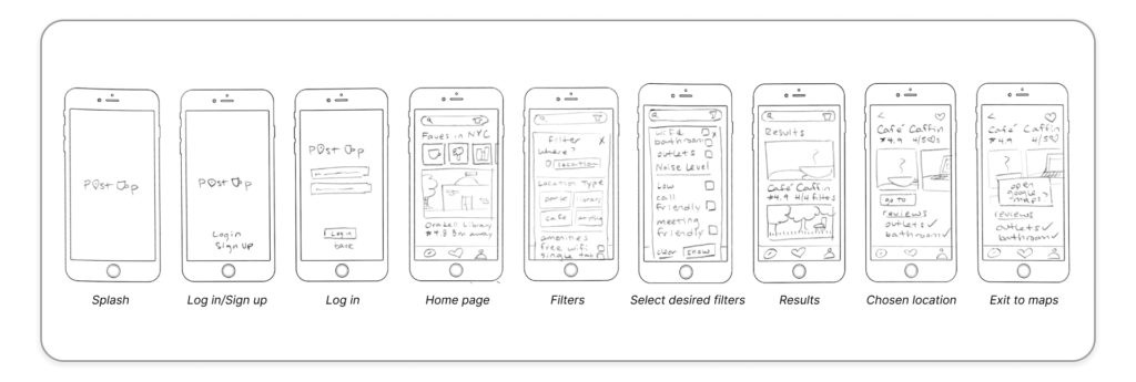
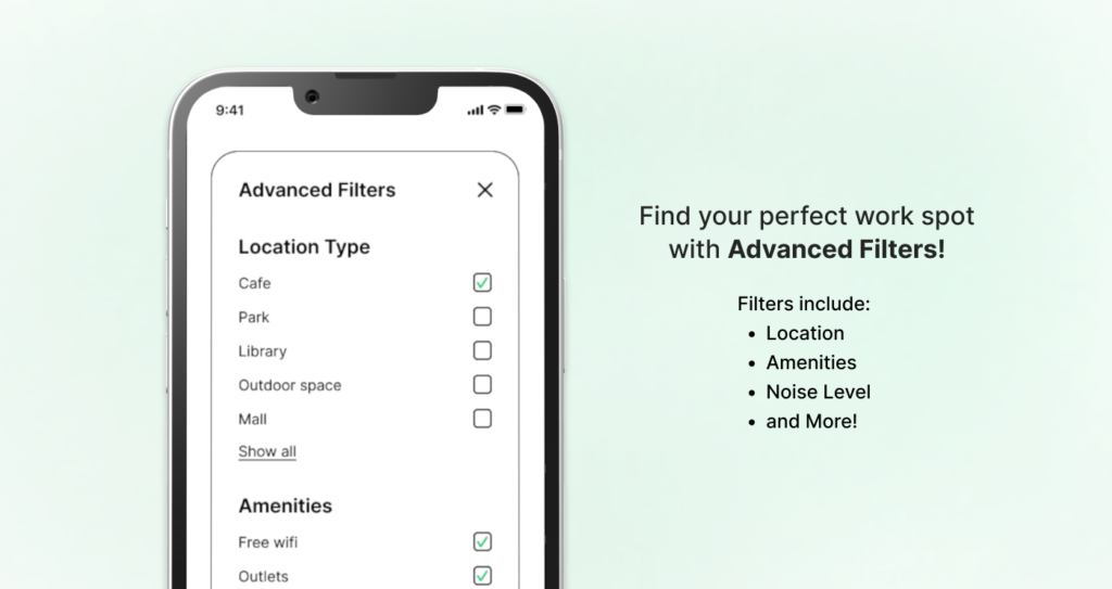
My process of creating these storyboards was driven by the desire to keep visuals clear and navigable for users. Clarity not only would help the users in having a solid idea of what a space would potentially be like, it would help them see the available amenities that they otherwise wouldn’t have considered were important. Including filter options like “noise level” and “location type” would help curate a wide list of options for users and will make them more likely to find a place that fits their needs.
Day 4: Build a Prototype to Test
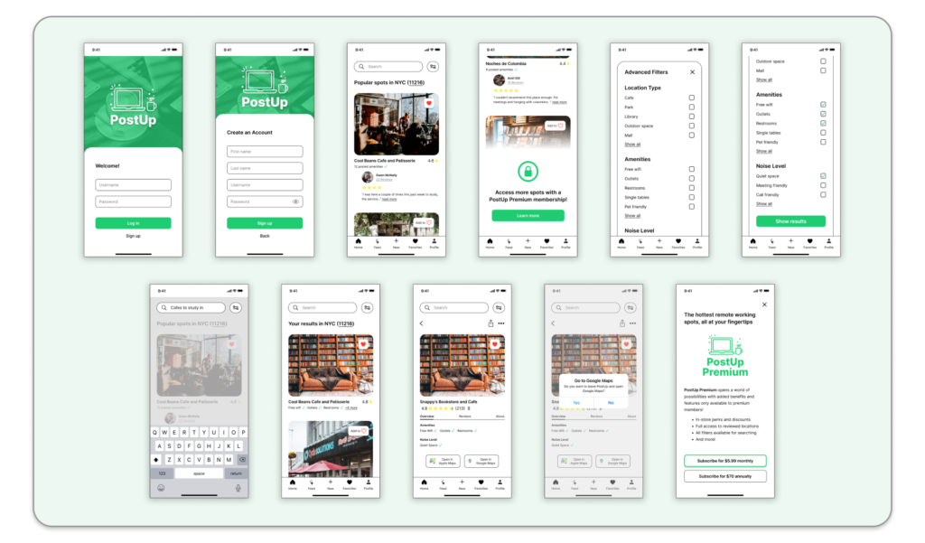
click here to use the prototype
I chose to create the PostUp screens Figma and jumped right into creating a high fidelity prototype. With developing these screens, I knew there were a few things that were necessary to see in the final product. These included:
- UI in line with PostUp’s branding and color scheme
- A way for users to filter what they want in a location
- Calling attention to the pay-to-use feature in the app
Keeping these features in mind helped me to quickly generate the screens needed to properly conduct a usability test for Day 5.
This leg of the sprint only allowed for a couple of hours to work on the prototype. I chose to focus on developing the key features that users would need to properly navigate the app. My goal was to have a realistic prototype by the end of the day so that users would be able to test it the next day.
Day 5: Validate Designs with Testing
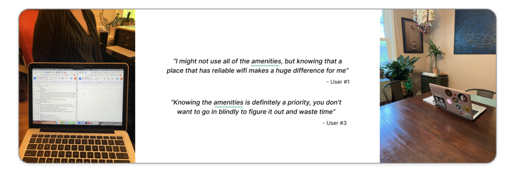
On the final day of the sprint, I conducted five rounds of user testing with the PostUp prototype I had created. The users I recruited were selected based on criteria related to their occupation and working habits. This included:
- Working either fully remotely or hybrid
- Frequenting cafes, libraries, or other remote work friendly locations
- Using apps like Google and Apple Maps to find places to work from
What I looked to uncover from testing was to see if there were hiccups with users navigation, where they had difficulty understanding the content, and if they had any issues with the application in general. Another important factor to consider was whether or not users felt aided in their process of finding a spot to work in with the filter option. With this criteria in mind, I conducted all tests with an iPhone 14 that had the prototype ready to test with via the Figma app.
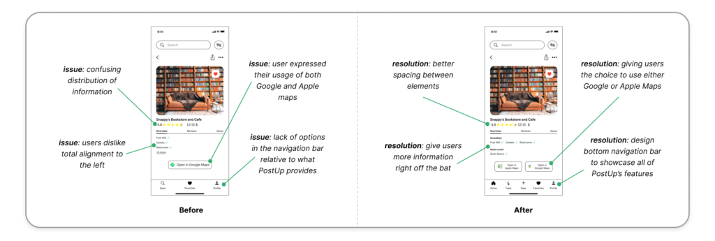
The results from the testing had very positive feedback regarding navigation and ease of understanding throughout the app. Users expressed interest in the locations themselves and liked seeing the amenities next to the results. There were little to no hiccups while accomplishing the tasks, and the comments users made during the tasks were mostly regarding elements in the UI that they would like to see changed. I took the comments and made adjustments to the UI to create an even more seamless experience.
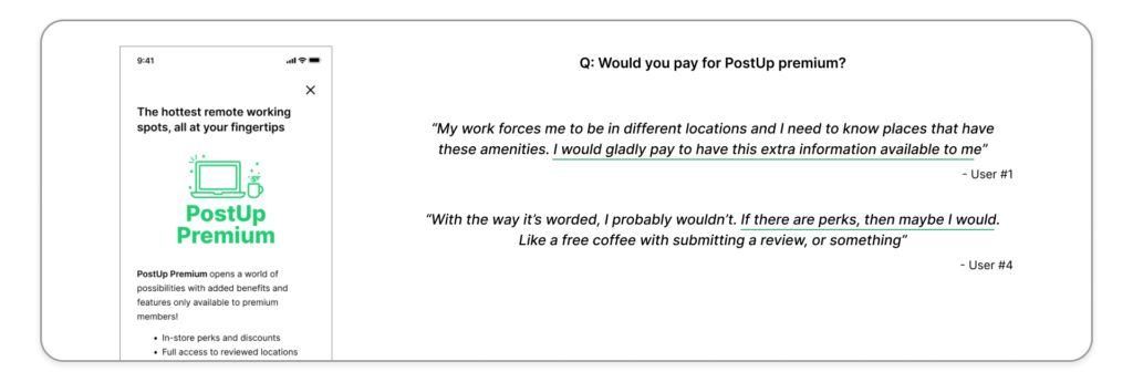
From synthesizing the interview notes I found some interesting feedback to glean from.
- 5/5 users would recommend PostUp to a friend
- 5/5 users found the filter feature vital and very important
- 1/5 users would pay for premium at its current state, but 5/5 would if it had perks for them
This last bullet point was very interesting to me considering an important element of this new PostUp feature is getting users to pay for a premium membership. When asked further, all of the users said that they would be more inclined to pay for premium if PostUp offered perks or exclusive deals to those members. This would be something to discuss further with the PostUp team as it could potentially expand their current user base.
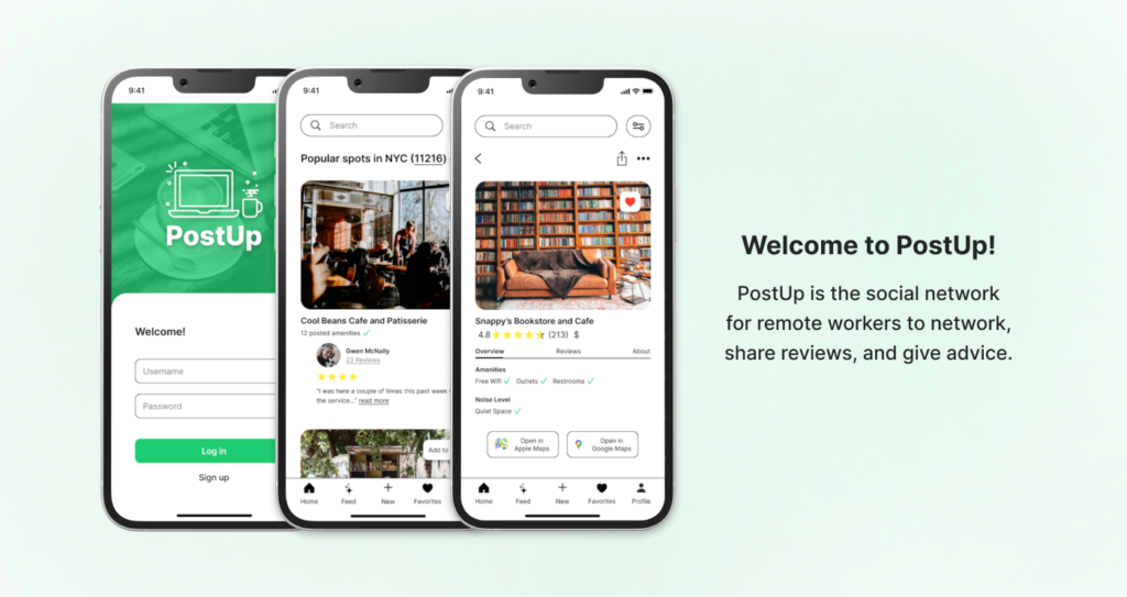
Introducing PostUp
End of Sprint
What I Learned
Time management is key. While this applies to all types of projects, this week has taught me that being able to manage time well is instrumental to a successful design sprint. Some days were a little lighter than others work wise, so I spent that extra time planning out my next steps to give future Neeka an easier time. I noticed that I felt more relaxed at the beginning of the day when I knew what needed to get done in the day rather than figuring it out in the morning. This is a technique that I’d definitely employ on all future projects.
Always utilize design tools. I’m constantly learning more methods and tricks with the design tools I have at my disposal, but there is always a lot more for me to learn. My mentor had pointed out instances where I didn’t use autolayout in Figma when designing my screens, and it made me realize how much time I had wasted by not using these tools properly. Adjusting and recreating screens with the proper usage of these tools saved me a lot of time and I’ll be sure to be more mindful of it in the future.
Stick to the script. When given projects I oftentimes want to go crazy with ideation and let my creativity run wild. With projects like this sprint, however, there is already an established brand and identity. I would constantly refer back to what was given in the research portion of the sprint to make sure that what I was creating didn’t deviate from the brand itself. These guidelines helped me to create a product that fits with the PostUp brand in terms of their UI as well as the features they deemed necessary to keep.
Next Steps
Add user submitted photos to results. This would offer users more insight as to what locations look like and the general vibe of the place. Photos submitted by users would be an interesting way to see a “real life” view of the location, and giving users the option to add photos to their reviews would be a good way to connect the PostUp community together.
Report to PostUp about their “pay to use” feature. During user testing, all of the users had expressed that they would not be inclined to pay to use PostUp unless it came with incentives. While I was initially surprised at this, I later realized that this was a great point from the users. This is one of the criteria set by PostUp and it conflicts with user interests; how can we make the users excited to pay to use the app? If I could work on this more, I would present this to PostUp to see what can be done.
