TWIDDLE
Bringing fun and relaxation into a fidgeting app designed for discretion
Timeline: 5 months, November 2022 – March 2023
Role: Sole product designer with mentorship from a Senior UX Designer
Tools: Figma, Miro, Marvel, Pen and paper
Constraints: Project prompt, time limitation, sole designer

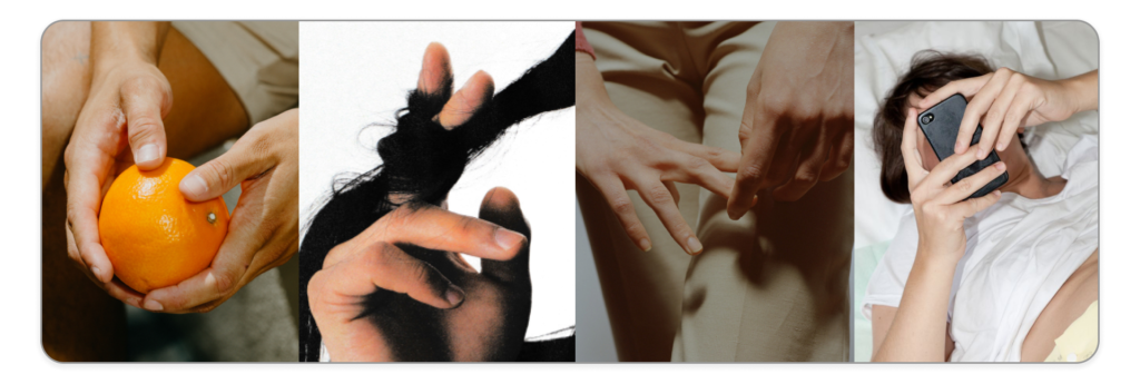
We live in a time where audial, social, and mental overstimulation is a part of our daily lives. Whether it’s at work, on public transit, or being around crowds of people, the mind can be left buzzing and craving moments of relaxation. Relief for these moments can come in the form of using fidget objects, but social norms oftentimes do not allow for people to freely use fidget objects without facing scrutiny of some kind. Corporate environments are spaces where people remain on high alert when it comes to how they present themselves, which begs the question: how can users decompress in public while not drawing excessive attention to their fidgeting?
Problem Statement: Users want a way to fidget and decompress while around others but do not like the connotations that marketed fidget objects carry.
Problem Discovery
I have been a lifelong fidgeter and have developed an eye for spotting how often people fidget while in public. This had ignited a curiosity in me and begun to ask myself; why isn’t fidgeting more socially acceptable if people are doing it so often? I began my secondary research into all realms of fidgeting and discovered a few key highlights:
- People fidget no matter what their occupation, age, or general location may be.
- The problem is less with the act of fidgeting itself and more with what people fidget with.
- The issues people find with marketed fidget objects are in their connotation, aesthetic, and overall lack of integration with the typically-functioning adult sphere.
While keeping these highlights in mind, I found a niche where fidget objects are inherently recognized as acceptable in a contemporary space; wearable objects and mobile devices. Identifying this niche began my process into my primary research to see what users really think about fidget objects.

Screener and Interviews
I generated a screener test looking to understand more about people’s perceptions and habits towards fidgeting. This screener had eight multiple choice questions for users to answer, and from the 30 users who answered the questionnaire, 5 were chosen to participate in user interviews.
These 5 participants ranged in ages 23-26 and in degrees of fidgeting. My goal with these interviews was to:
- Uncover truths and feelings about fidgeting
- Discover what users fidget with
- Reveal general thoughts about marketed fidget objects
Five questions I sought to answer in these conversations were:
- Why do people generally choose against buying marketed fidget objects?
- Does being in the proximity of your phone give comfort?
- Do people feel comfort in wearing adornments (rings, bracelets, watches, necklaces, etc.)?
- How do people react when seeing someone fidget with their phone or adornments?
- Would people want to learn about why they fidget?
From over 115 minutes of conversation gathered from these 5 interviews, I was able to generate two distinct groups of fidgeters that would be expanded upon further in my personas:
- The open fidgeters
- The reluctant fidgeters
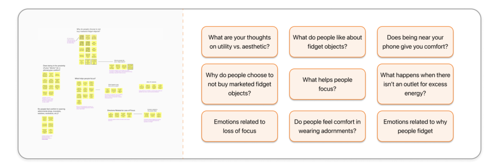
My next step was to synthesize this information in the form of affinity mapping.
Affinity Mapping
Through affinity mapping, I was able to take the data I collected from my interviews to generate questions and ideas without including my own biases and preconceived notions. I got a lot of great insight from this process:
- 60 total post-it’s after breaking down the interviews
- 9 distinct groups of information
- 3 groups that gleaned the most information related to devices, focus, and marketed fidget objects
Having my data analyzed and put into concise groups of information made a clear path for me to now dive deeper into the users pain points, goals, feelings, thoughts, and behaviors. I would accomplish this through synthesizing my data and making a JTBD framework and personas.
JTBD
Through the JTBD framework, I was able to make a concrete plan for what a fidgeting user does, what they need, and generally where they would be fidgeting. Users need to be able to have these positive associations while working on a task to better improve their self esteem in the long run.
Personas
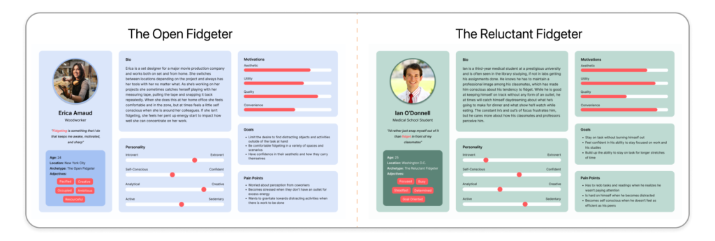
With generating these personas, I needed to pay extra attention towards eliminating any biases or preconceived notions I might bring. For these two personas I referred to my questionnaire answers as well as my notes from my user interviews.
There were two groups of thought when it came to those who fidget;
- some are very comfortable fidgeting around others, known as the open fidgeters
- and those that are more reserved regarding fidgeting, known as the reluctant fidgeters
Where and when and why they fidget manifest themselves in different ways, but their goals are very similar. Both want to stay focused, remain on task, feel good about themselves and their productivity, and have an outlet to expel excess energy.
Now that I knew who I am meant to be designing for, I needed to figure out potential solutions to their problem. My next goal was to create How Might We questions to help streamline a path towards finding a solution to my problem.
How Might We? Questions
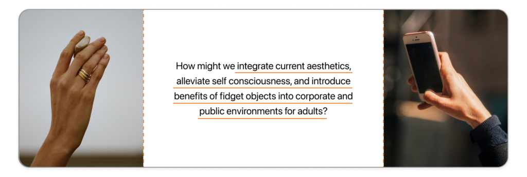
Getting to this point in my research brought me to a key insight:
- Users understand and are attracted to the benefits of fidget objects, but the fidget objects currently on the market are not appealing to a contemporary adult user base.
Whether it’s aesthetic, connotation, or general unawareness of current fidget objects, users are dissuaded from purchasing fidget objects while also desiring the relief they bring. With these considerations in mind, as well as my previous research to supplement it, I was able to generate a How Might We statement:
How might we integrate current aesthetics, alleviate self consciousness, and introduce benefits of fidget objects into corporate and public environments for adults?
Generating this statement would mark the end of my research and be the launching point for my ideation process.

Brainstorming Potential Solutions
I have a background in industrial design and our process is similar to the UX design process in the way that brainstorming is a key stage for creating great ideas. My ideation process began the same way I would start industrial design projects; sketch and write out 50+ ideas onto an 11×17 sheet. I wanted to think of all possible avenues a fidget object could go, such as the digital and physical realms. After generating all of my ideas, I began sorting through them and putting them into similar groups of ideas.
Through converging I was able to create three groups of ideas that could become potential solutions:
- A fidget object device that tracks fidgeting and rewards you when you complete relaxation exercises
- A productivity tracker app + device that tracks how often you fidget and reminds you to take breaks during the day
- A wearable object that collects your fidgeting data, looks attractive, and comes with an accompanying app for users to see how often they fidget
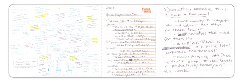
From considering these ideas and discussing with my mentor, I decided to choose and expand on idea #2. While I found all three ideas valid and fun, I decided that this solution yielded the most potential for usability. This potential solution was to become a mobile application, since mobile devices are already integrated into the majority of people’s lives.
Once this potential solution was decided on, my next step was to do a competitive analysis to see if there were fidgeting applications similar to what I was trying to accomplish.
Competitive Analysis
In the pursuit of finding similar fidgeting and relaxation apps, I identified three apps that have elements that I wanted to emulate and aspects that I thought should be avoided entirely. These three apps were:
- Tappy
- Fidget Toys 3D
- Endel
The aspects of the apps that should be avoided are excessive flashiness, poor and overwhelming navigation, and general inconsistencies as far as UI elements go. This was especially the case in the Fidget Toys 3D app. Aspects of the apps that I thought were great, especially in the Tappy and Endel apps, were minimalistic UI elements, clear and navigable routes, and consistency with the aesthetic of the applications.
My takeaway from the competitive analysis was to make my application minimalistic with its UI elements, clearly navigable in its routes, and have the ability to marry discretion with interesting fidget options.
From gathering this information of existing competitors, my next step was to identify the primary needs, wants, and like’s of the user when using this application.
User Stories and MVP’s
To generate properly represented user stories, I gathered and referred to these parts of my research:
- Questionnaire notes
- Interview notes
- Competitive Analysis
Making these user stories helped me to better see how my application can serve these users properly and help them achieve their goals. If they had pain points, I wanted to help alleviate them.
I was able to prioritize different parts of my user stories and rank them in levels of importance and how much they could help the user. By making my MVP’s, I could see a clearer vision for how I can alleviate user’s pain points.
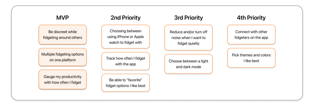
By looking at my user stories and MVP’s, I could create a stripped down version of what I knew should be in the application. My next step was to make a series of user flows using the red routes I generated. Doing this helped me to generate and iterate on how a user would go through the key flows in the application laid out by the MVP’s.
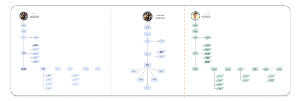
Mapping out my user flows would mark the end of my ideation process. From this point I was able to use the routes in my user flows to develop screens that would soon be in the user’s hands for testing.

Pencil Sketches
For the first iterations of my screens, I drew them out with pencil and paper to get my ideas down quickly and set aside a need for perfect lines. I took the information I generated from my previous research and especially my user flows to map out my red routes in three groups of screens.
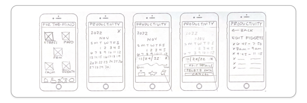
Once I felt like it was ready to get into the hands of users, I scanned my sketches and put them into Marvel to let users test them out. From this I conducted 5 guerilla tests to see how users responded to the screens, the interactivity of them, and their overall understanding of them. After synthesizing my testing results and examining my screens further, I was ready to get these sketches into Figma.
My next steps in Figma were to adjust the hierarchy on the screens, reduce the visual bulk of information, and to make the layout more welcoming for users.
First Iterations of Wireframes
Creating the wireframes in Figma took a combination of my synthesis from the guerilla testing and my understanding of layout and graphic design skills. Since this application was going to be used to fidget and relax, the design needed to be minimal, easy on the eyes, and welcoming.
My goal for this step was to make the bones of the application and to make it close to the end result in terms of simplicity and legibility.
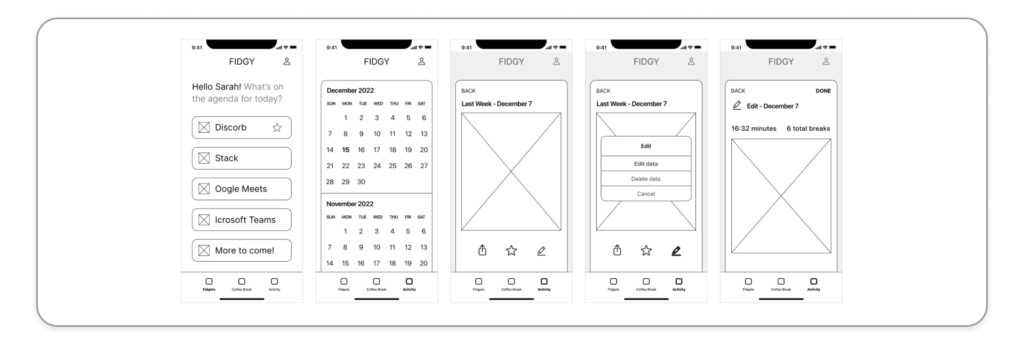
It was at this stage where the idea came to me to emulate existing and interfaces for users to fidget with. This would become the driving force through designing the interactivity of this app and seeing how fidgeting interactions could be discreetly embedded within the screens. With apps used for workplace communication, the screens are already familiar to users and held a lot of potential for having fun haptics while appearing professional and work friendly.
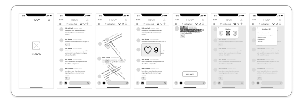
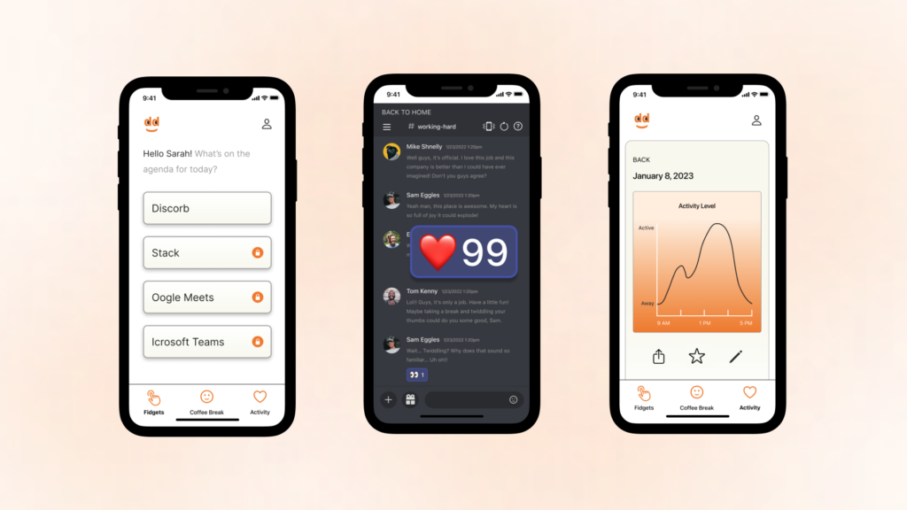
This stage is where I was able to test out and have fun with the interactivity of the fidgeting UI in one of my red routes. It became a test of how discreet I could make the actions look while also being fun and inviting for users who want to fidget. For the fidgeting screen I decided to pick Discord as the communication app that I wanted to emulate for one of the fidgeting UI options. It has a friendly and familiar interface for users and is often used as a communication platform in different industries.
I thought of inserting a question mark button in the top banner for users to click on when they want to understand more about what their fidgeting options are. The user should have the reassurance that they won’t feel lost with using this application, so this button can mitigate that risk.
Now that there was a skeleton for this app to be built on, my next steps were to be able to elevate the experience with typography, color, and layout.

Designing this application was very exciting for me as it combines my love for telling a design story with my past experience of developing style guides, moodboards, and graphic elements. This portion of the process helped take the wireframes and added depth and the storytelling element that I wanted users to see when using the application.
Moodboard
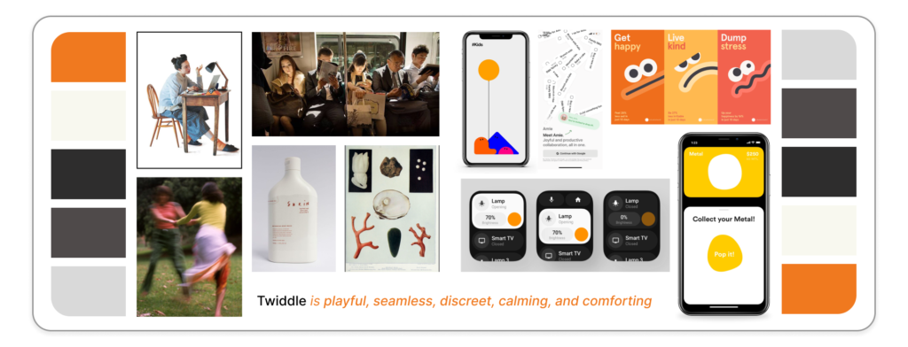
Creating this moodboard helped me to collage images, colors, emotions, and ideas together to give this application life. While doing this, I decided to name the application Twiddle.
Twiddle (verb): to move something repeatedly between your fingers, especially without any purpose.
This word embodied the energy that Twiddle would have; having fun while also not being too serious, and giving yourself a moment for respite.
With this moodboard to refer to, my next step was to move on to further expand on the branding and UI elements that Twiddle would have
Icon and Graphics
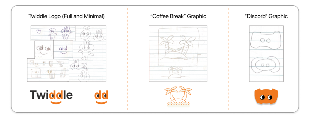
As with all of my ideation, I began with sketching out what I envisioned for the Twiddle icon. I was inspired by Clippit (aka “Clippy”), the intelligent user interface for Microsoft Office in the early 2000’s. In an office setting, a character like Clippy adds fun and humor in an otherwise serious work space.
After sketching and refining my idea, I landed on the Twiddle icon being a face integrated into the name as well as a standalone cut out of the face in the Twiddle name. This character would be the face that I thought could embody the character of Twiddle the best.
This process of sketching, refining, and transferring them into Figma would be my process for creating other graphic elements in the application. Alongside this, I would develop my style guide to showcase the typography, colors, and other elements that would characterize Twiddle.
Style Guide
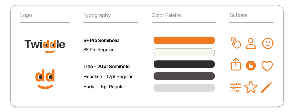
For the style guide, I wanted to have a font that is legible in different font sizes and levels of boldness. I decided to go with SF Pro as it fit the criteria previously stated as well as being a standard in the iOS system. In the same vein I chose to use existing iOS icons for the buttons and navigation for users to not have to relearn a new system entirely. These choices were made with the user’s ease of understanding in mind and for my choices to make them feel welcome when using Twiddle.
Since Twiddle is meant to give the user a way to relax and unwind, the chosen colors needed to emulate those same characteristics. All style choices were made with accessibility in mind and I used WebAIM to make sure the colors were in line with their standards. I chose a muted palette with a range of grays and off-whites to keep in line with the minimalist graphic elements with a pop of color in the orange. This singular color pop adds the playful element that I saw as prevalent in the Twiddle narrative.
With the marriage of the high fidelity screens, UI family, and overall design elements together, I was able to take a fully formed application and begin to conduct usability tests with Twiddle.

Usability Testing Round 1
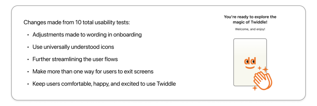
Using Twiddle’s high fidelity screens and selected red routes, I began conducting usability tests with 5 selected participants. In my first round of testing my goal was to see if there were hiccups with users navigation, where they had difficulty understanding the content, and if they had any issues with the application in general.
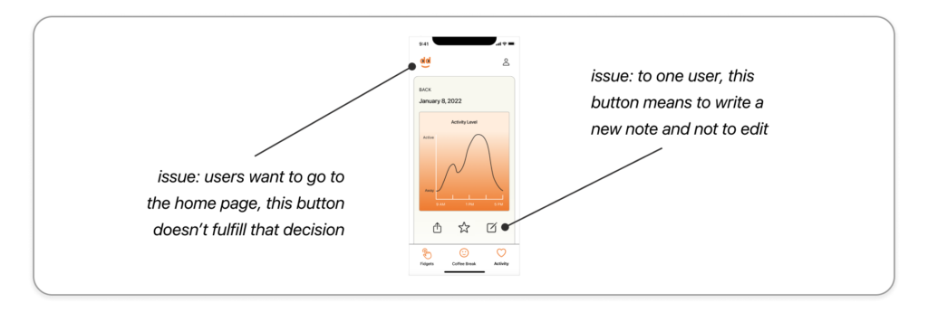
An issue that had come up in 4 of the 5 tests was with users wanting to click on the top left icon to redirect them to the home page. Other issues that were brought to my attention were confusing wording in the onboarding and an incorrect use of a button which one of the participants had an issue with.
My next steps were to edit some of the buttons, clarify semantics in the onboarding, and edit the redirect button to go back to the homepage.
Usability Testing Round 2
For the second round of testing I recruited 5 more participants to test Twiddle with its updated changes. My goal for this second round was to make sure the changes made were implemented well as well as making note of the speed and ease in which the participants went through the three test routes.
With this concluding my user testing, my final goals were to have fun while testing out Twiddle and stay excited for future changes and elements to be made.

Welcome to Twiddle!
Click here to use the prototype
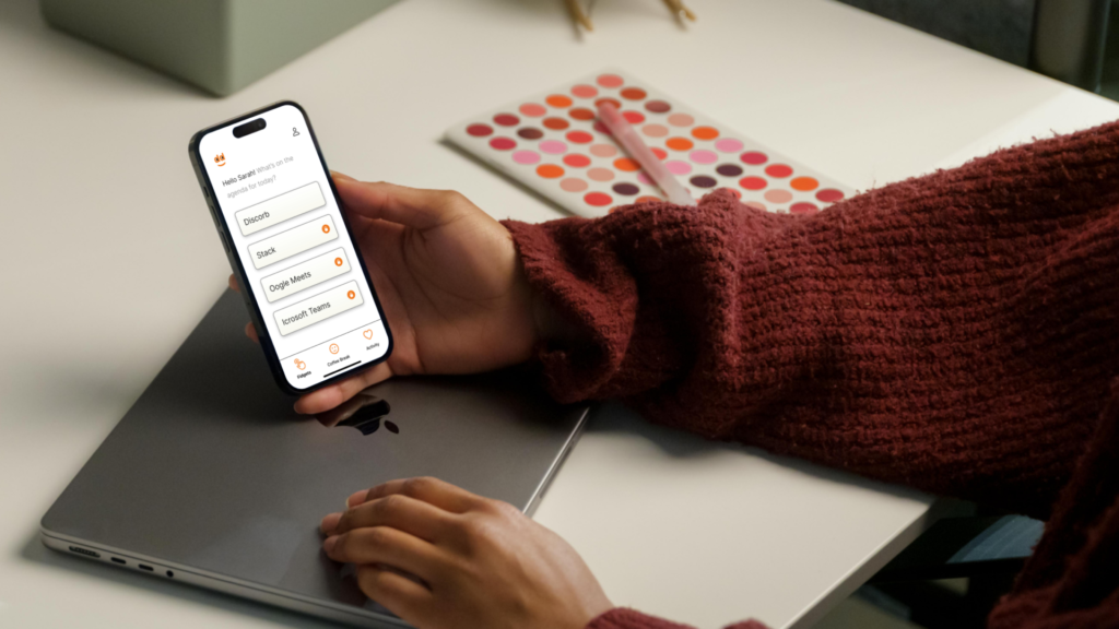
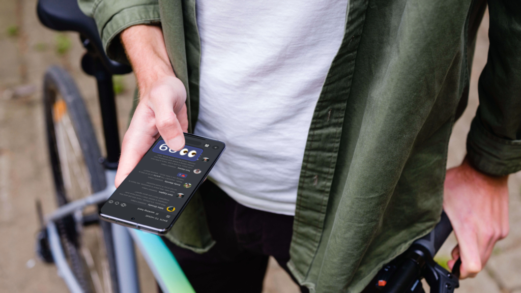
Twiddle, the app designed for fidgeting and relaxation with discreet UI to appear like a workplace communication app.
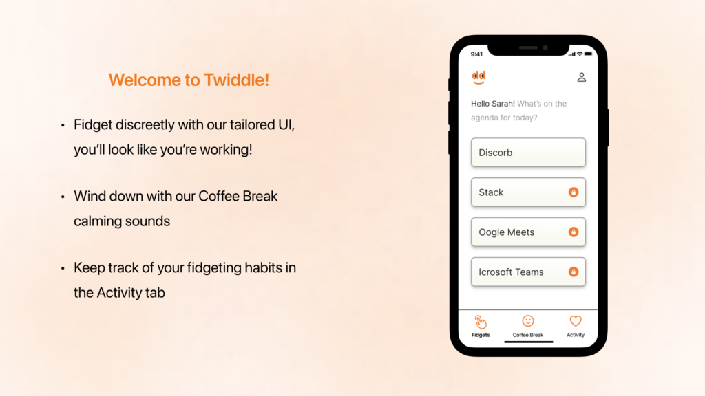
These are Twiddle’s key features to satisfy user’s needs in different scenarios.
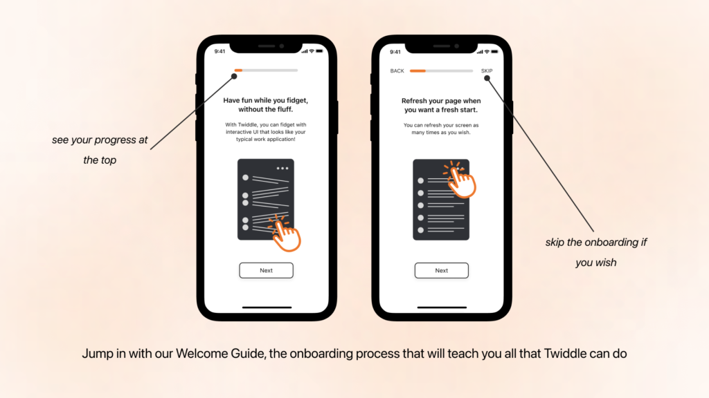
Once you sign up, you are guided through Twiddle and its features through our onboarding process which we call the Welcome Guide. Your progress is indicated at the top and you have the option to go back or skip it altogether.
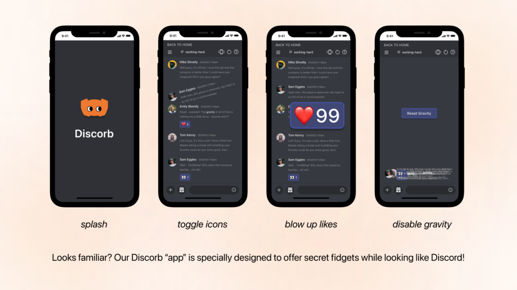
While it may appear like you’re using Discord to communicate with your coworkers, our Discorb screens are purely for fun! The fidgeting UI has hidden interactions for users to tap, push, swipe, and more.
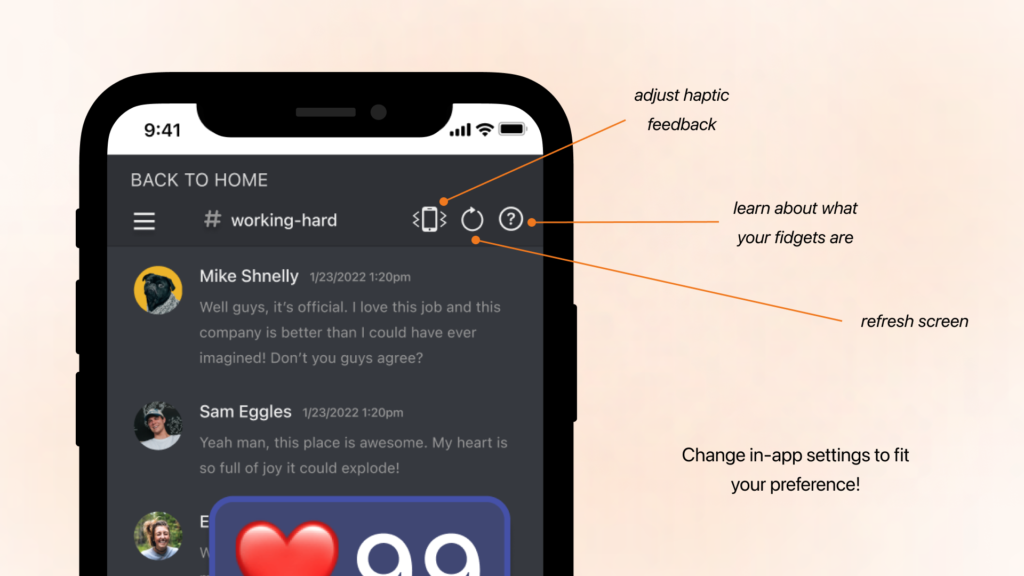
We understand that everyone has a preference for haptic feedback, so we included a way for users to adjust the haptics within the fidgeting UI. Users can refresh the screens with just a tap to set it back to its original settings and get a refresher on what their fidgeting options are with a tap on the question button.
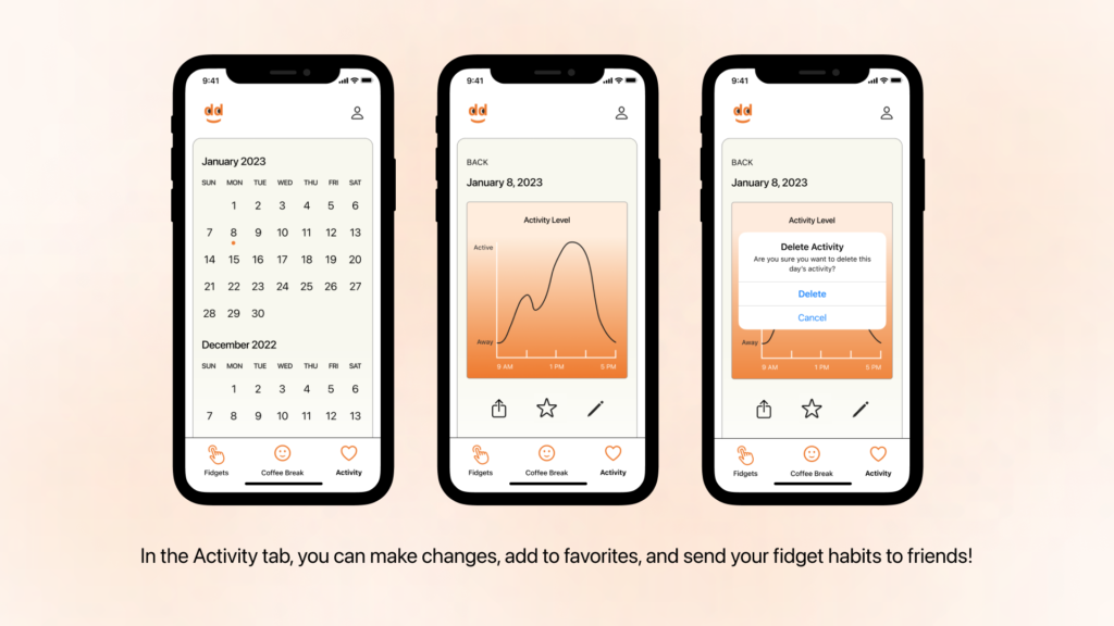
You can keep track of your fidgeting habits, preferences, and overall actions within the Activity tab. Within your logged days you can delete or edit activity, or simply take a look at which fidgets you use the most!
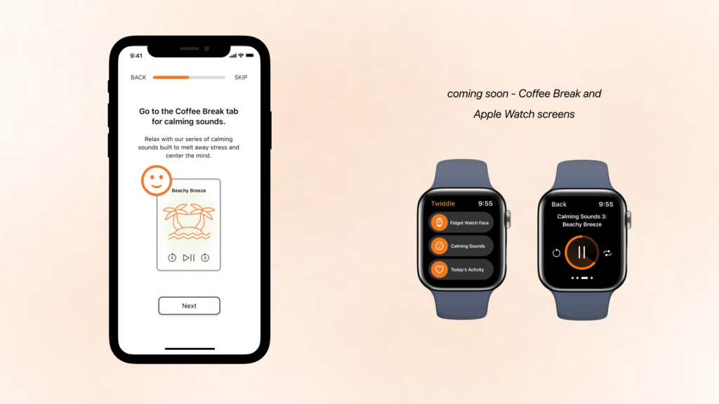
The next screens that I want to produce are the Coffee Break screens, where users can listen to calming sounds to decompress and relax, as well as the accompanying Apple Watch screens.
I wanted every aspect of the app to have character and to tell a story, down to how the screens flow from one to the other.
Final Thoughts
What I Learned
Manage time to keep the process moving. Oftentimes I got hung up on making parts of Twiddle look perfect or got frustrated when I couldn’t translate what was in my mind onto Figma. Finding a flow between working and stepping back to see what needs to be changed is a process that I am trying to refine while in the design process.
Learn new design tools constantly. While in the beginning stages of this case study, my mentor suggested that I could benefit from learning autolayout on Figma. From watching youtube videos and constantly failing, I eventually got a grasp of autolayout and used it in my final screens. From seeing how much easier my process became from learning this tool, I’m now eager to have more design tools in my repertoire.
This app isn’t only for me, it’s for the world. I would become attached to a solution idea or way that this app could be manifested, but I had to constantly remind myself that the users’ needs come before mine with what this app will end up being. While I can be excited about a potential solution, I ultimately have to put user feedback and input at the priority. Thinking about the process this way paid off with the feedback I received at the last round of user testing.
Challenge myself every day, but don’t bully myself. With this being my first UX/UI project in my bootcamp, I would let the perfectionist bug bite me every day and feel down when I didn’t get more work done. As I’ve come to the end of this project, I’ve realized and will continue to remind myself that no project is ever perfect. I hope that I can continue to make mistakes, learn from them, and repeat the process over and over again.
